Five things I learned building Pills In, an iOS medication app for my dad
Design systems, jigs, TestFlight feedback and more.

When I launched Pegs Out, my dad was like... “Oh, you can build apps, can you? Well, I’ve got an idea for you...”
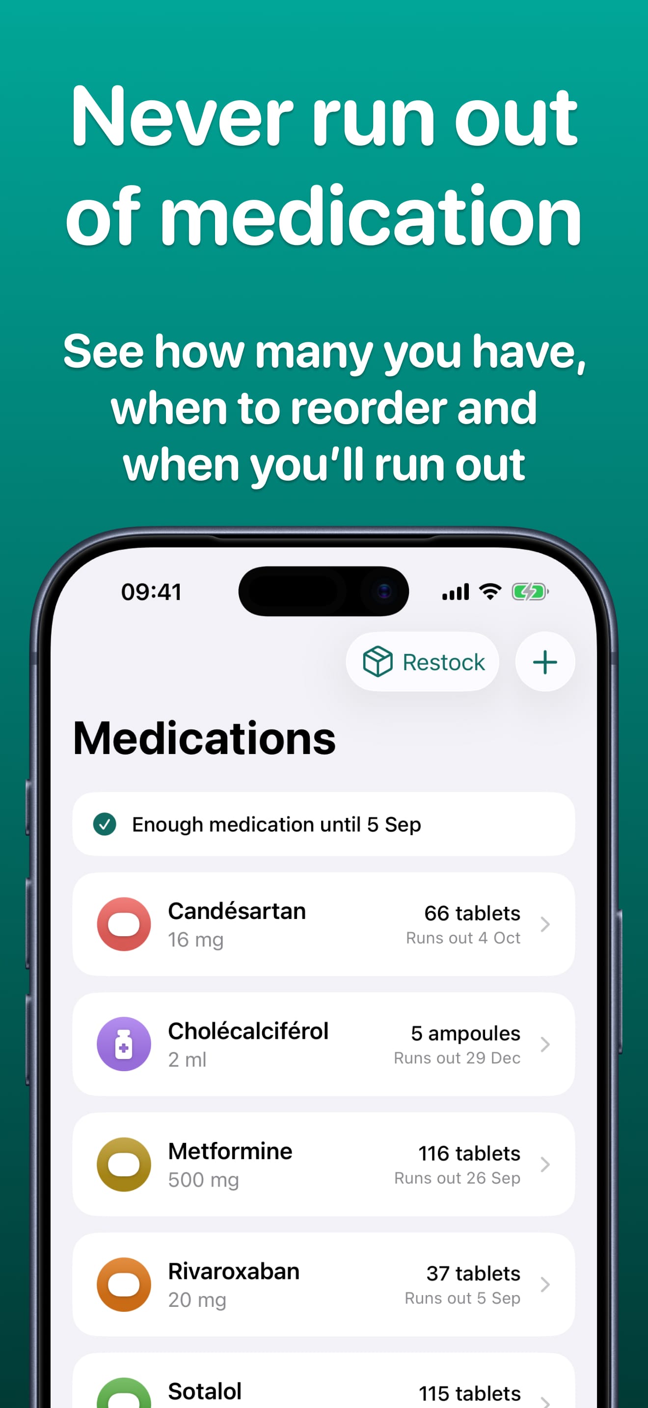
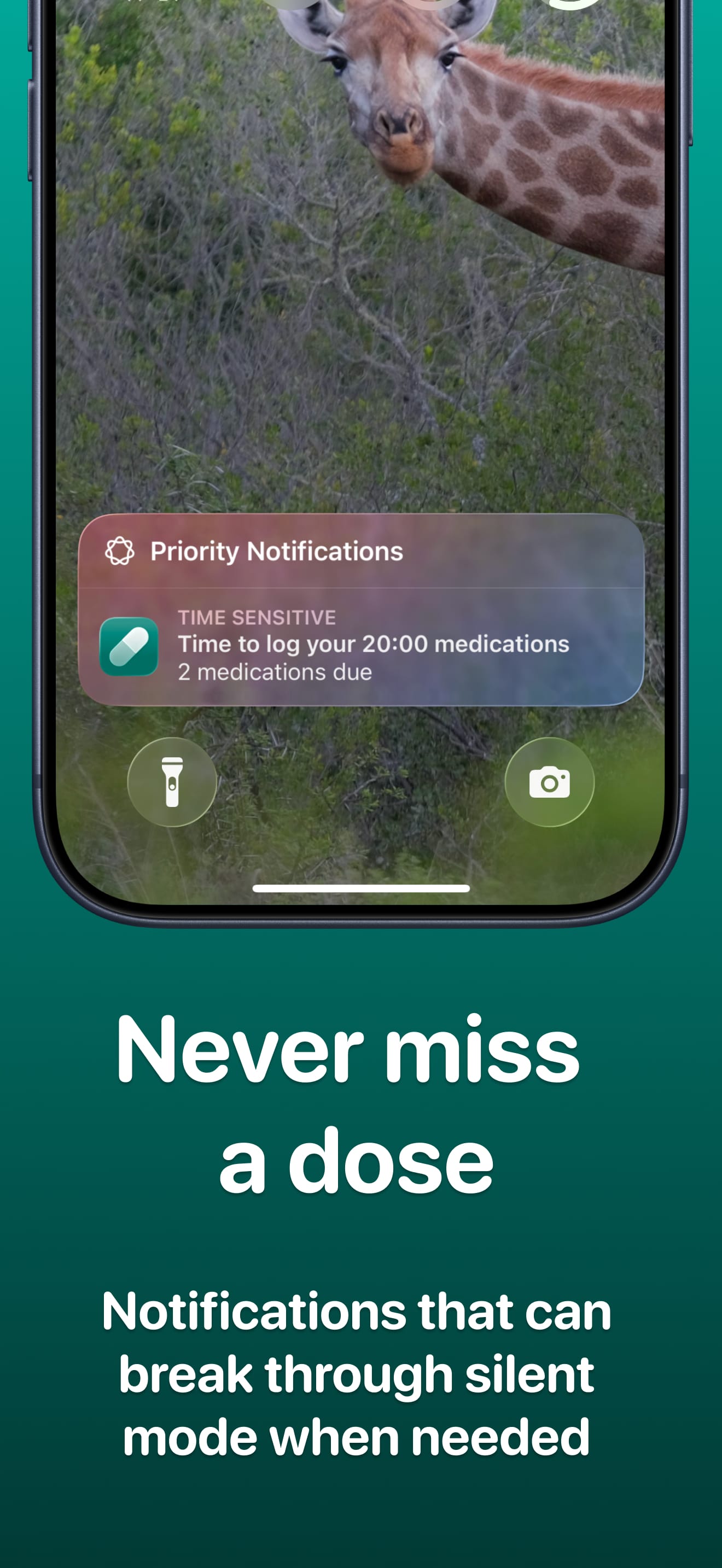
The result is Pills In, my second iOS app, which reminds you to take your medication and tracks how many doses you have left. Like Pegs Out, it’s free. It’s been on the App Store since August, but I haven’t had a chance to write about it until now.
A medication app that helps you manage your stock
My dad takes five different medications, and what he struggles with most is managing the stock i.e. making sure he has enough of each one at any given time.
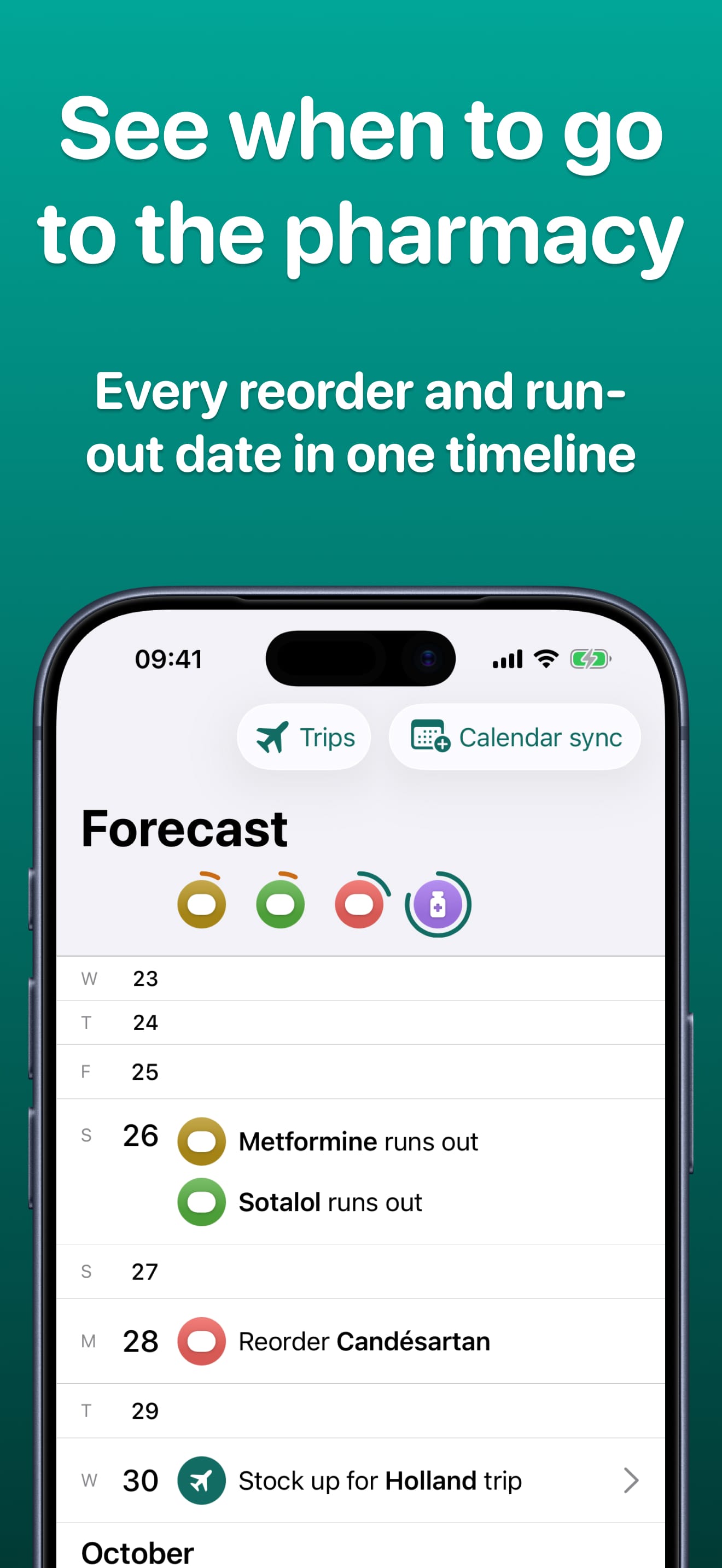
Imagine he’s going on holiday. Before he goes, he needs to visit the pharmacy and ask for enough of each medication to cover the days before the trip, the trip itself and a few days afterwards (because you don’t want to run out on the last day of your holiday, or have to rush to the pharmacy the moment you get home).
He’s been doing this in a spreadsheet because while there are a lot of medication apps on the App Store, none of them do this.
The other problem is the lack of support for complex schedules. Almost all medication apps give each medication a single schedule, so you can’t take one pill every morning and another of the same medication every other evening. This was another feature my dad wanted and was using workarounds for.
So I thought I would approach this by designing Pills In for one person only: my dad. If anyone else finds it useful because they have the same problems, that’s a bonus. But I wasn’t aiming to make a medication app for everyone.
As this was my second iOS app, I built on what I had learned making Pegs Out to improve the way I worked. Here are the five highlights:
1. Start with a brief, before any code
Before any code was written, I interviewed my dad about how he manages his medication at the moment. Then I got Claude to combine what he told me with some desk research (how other medication apps work and where they fall short) into a design brief.
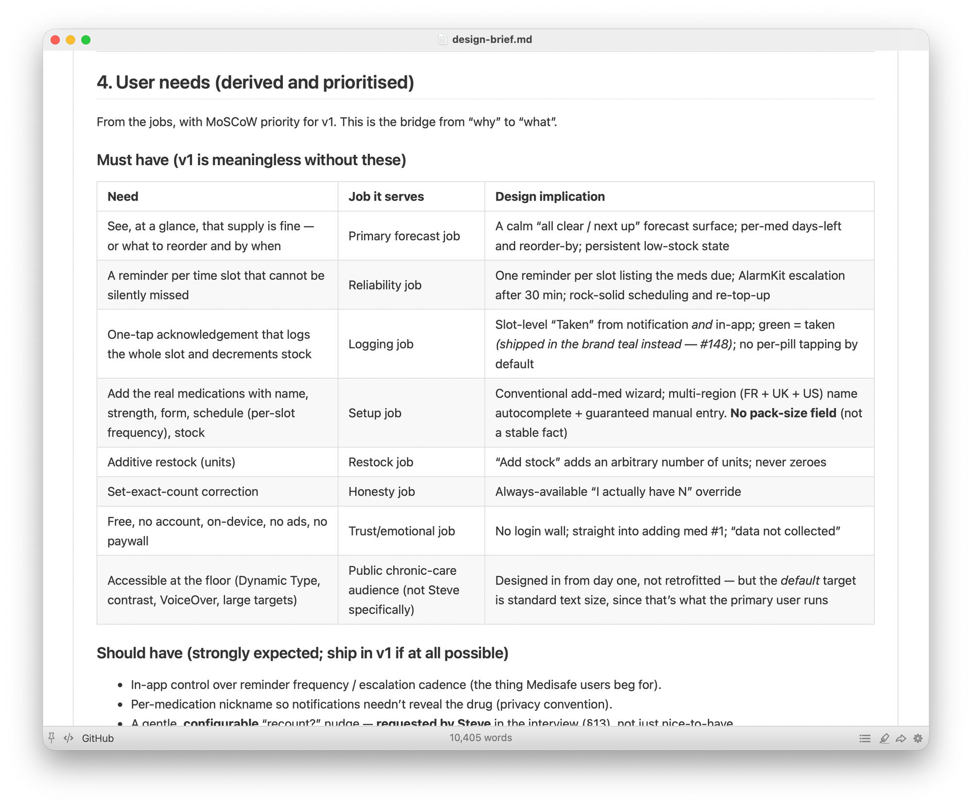
This is a long document: over 10,000 words. It covers who the app is for, the jobs he’s hiring it to do, design principles and the key journeys through the app. After I had interviewed him a couple of times, I sent him an initial version of the brief for review and feedback. I know this is pretty basic UX practice, but it’s worth doing even for a side project.
2. A design system you can browse on your phone
When you’re building a website, it’s easy to set up a design system in code, even for a side project. You can install shadcn and look through your components in Storybook, and get your coding agent to only use these components. iOS isn’t quite as simple: SwiftUI gives you some stock components, but nowhere near as many, and there’s no Storybook equivalent to see them all in one place (that I’ve found yet).
Pegs Out didn’t have a design system because it’s only got a few pages but for Pills In, I thought the app would be complex enough to warrant one.
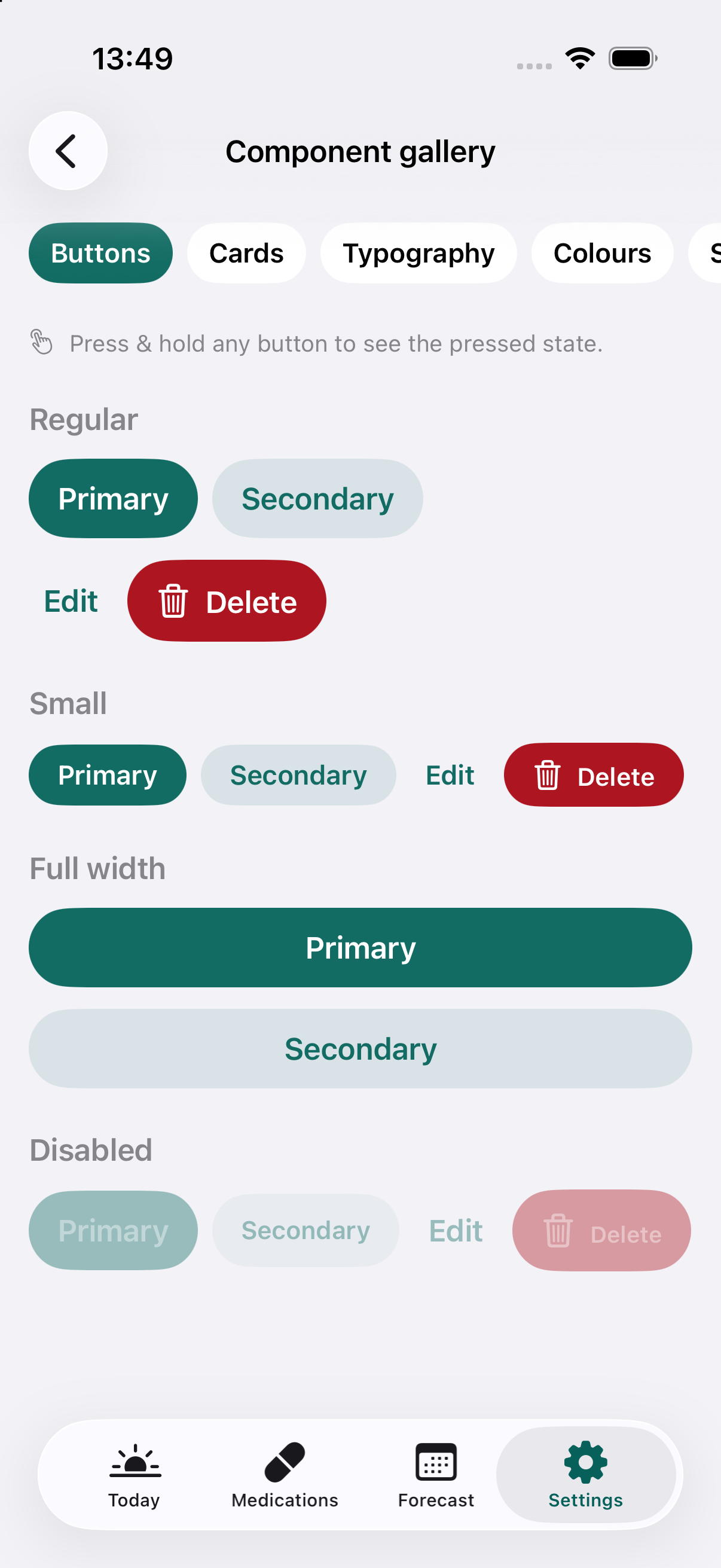
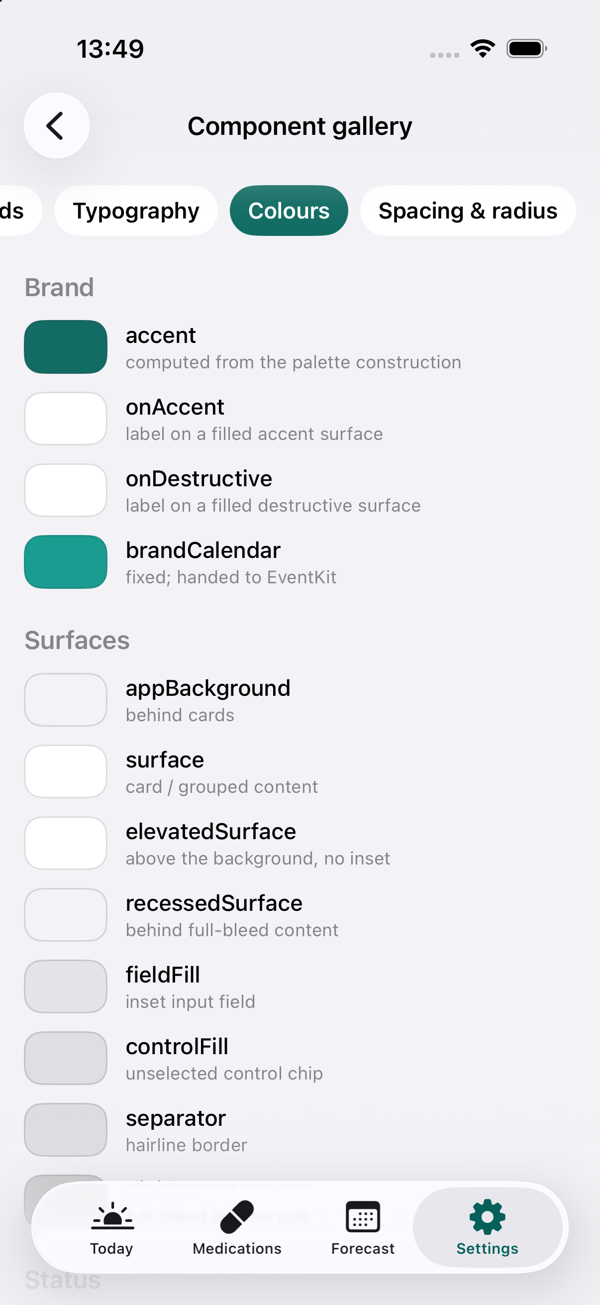
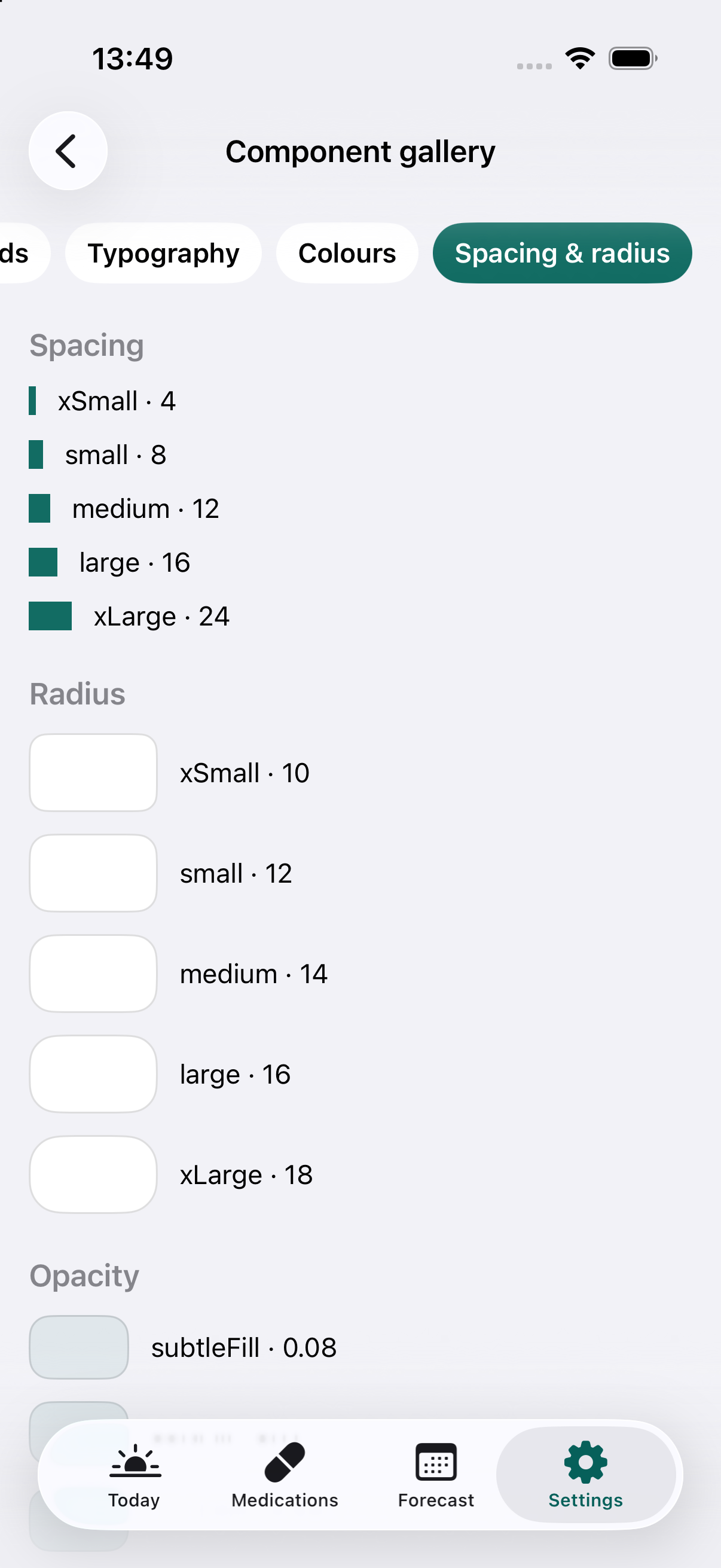
So I got Claude to create a design system, mostly stock SwiftUI components plus a few custom ones, with a rule that every screen had to be built from them. Then I had it build the equivalent of Storybook inside the app, on a hidden page in the settings. This meant I could browse every component in the simulator or on my phone while I was developing.
3. Get it working in stock blue, then derive the colour palette
When you’ve got a design system, it’s tempting to spend days styling components before you’ve built a single screen. But for something like Pills In, it makes more sense to build it using stock components and default colours first, then tune the visual design later.
I’m not a visual or brand designer though, so I asked Claude to research how a professional would approach this. It turns out you can derive a palette mathematically, in a way that’s accessible and where the colours have a harmonious relationship with each other.
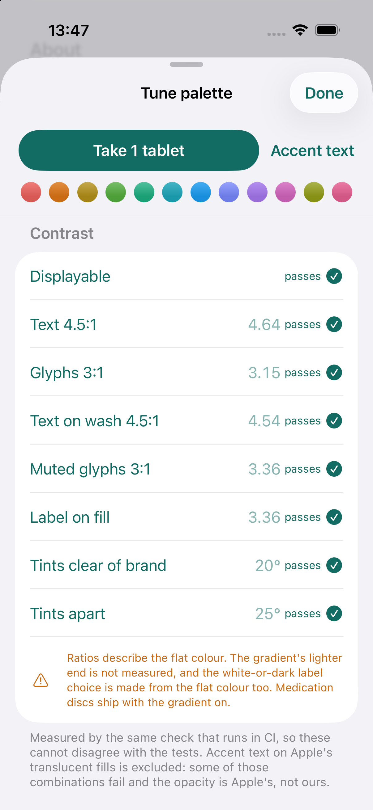
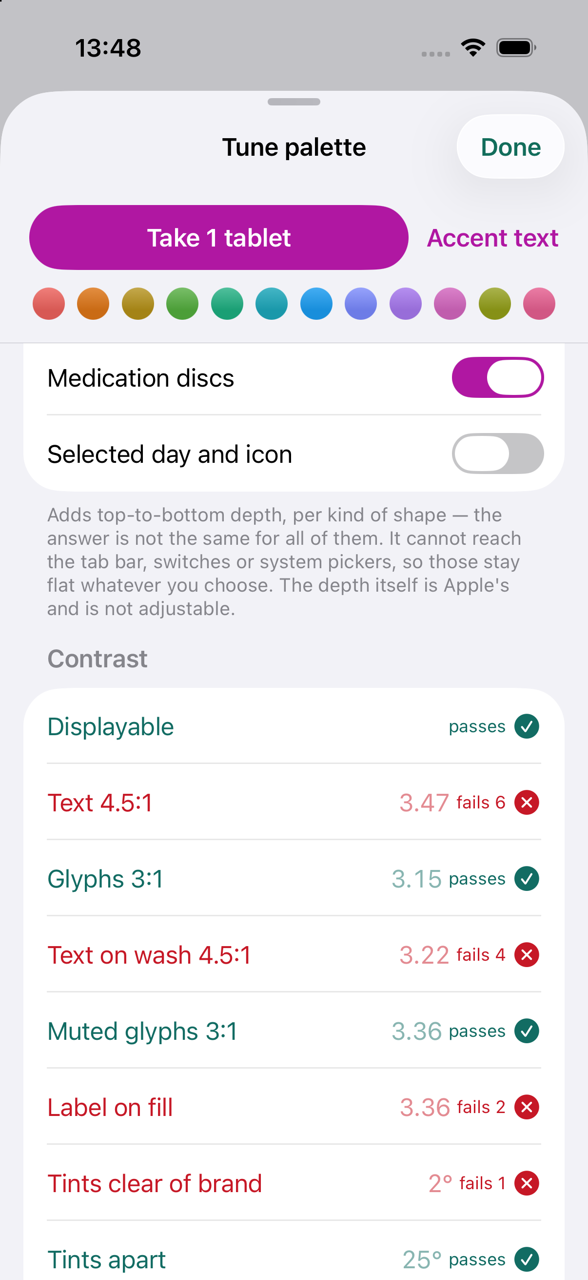
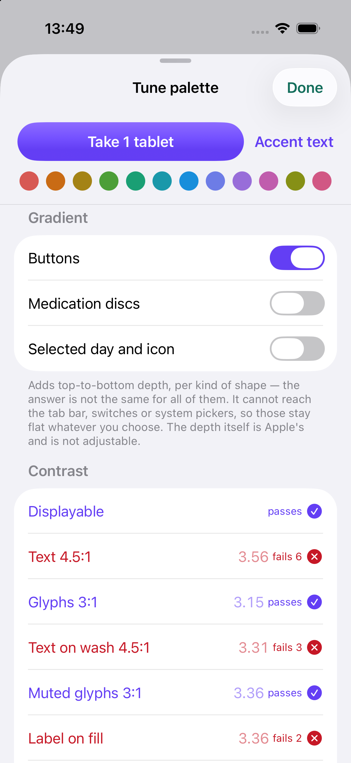
So I got Claude built a system where I chose a primary brand colour and the app generates everything else from it. This is one example of the next tip...
4. Use jigs to fine-tune the design in the app
Before AI, you’d do the final tweaks to a visual design in Figma. When you’re working mainly in code, you can do that fine-tuning in the app itself using a set of temporary controls.
I still used Figma for Pills In, but only enough to get my ideas out of my head: a couple of key screens. Everything else was built straight from the design system.
The best example is there forecast screen, which shows when you’ll run out of each medication. It’s very dynamic – there’s lots of motion and things change on screen as you scroll up and down – so not ideal for static mockups in Figma.
With a jig, you expose the variables behind the design (motion, spacing and colour) so you can tweak them and feel what it’s like in the real app. Once you’re happy, you copy the values back to your coding agent to lock them in, then remove the controls.
I used the same technique for the medication icons and when choosing the colour palette. It has pros and cons compared with Figma, but for something as dynamic as the forecast screen, doing the final tweaks in high fidelity, in the real app, makes a lot more sense.
5. Turn TestFlight screenshots into GitHub issues
Once you’ve got a build on your phone through TestFlight, you’ll end up spotting bugs and needing to tell your coding agent to make changes. On iOS, when you take a screenshot of an app you have via TestFlight, it lets you send it as feedback to App Store Connect, Apple’s developer portal.
You can then get your coding agent to retrieve these screenshots via the App Store Connect API, triage it and turn each piece of feedback into an issue in GitHub.
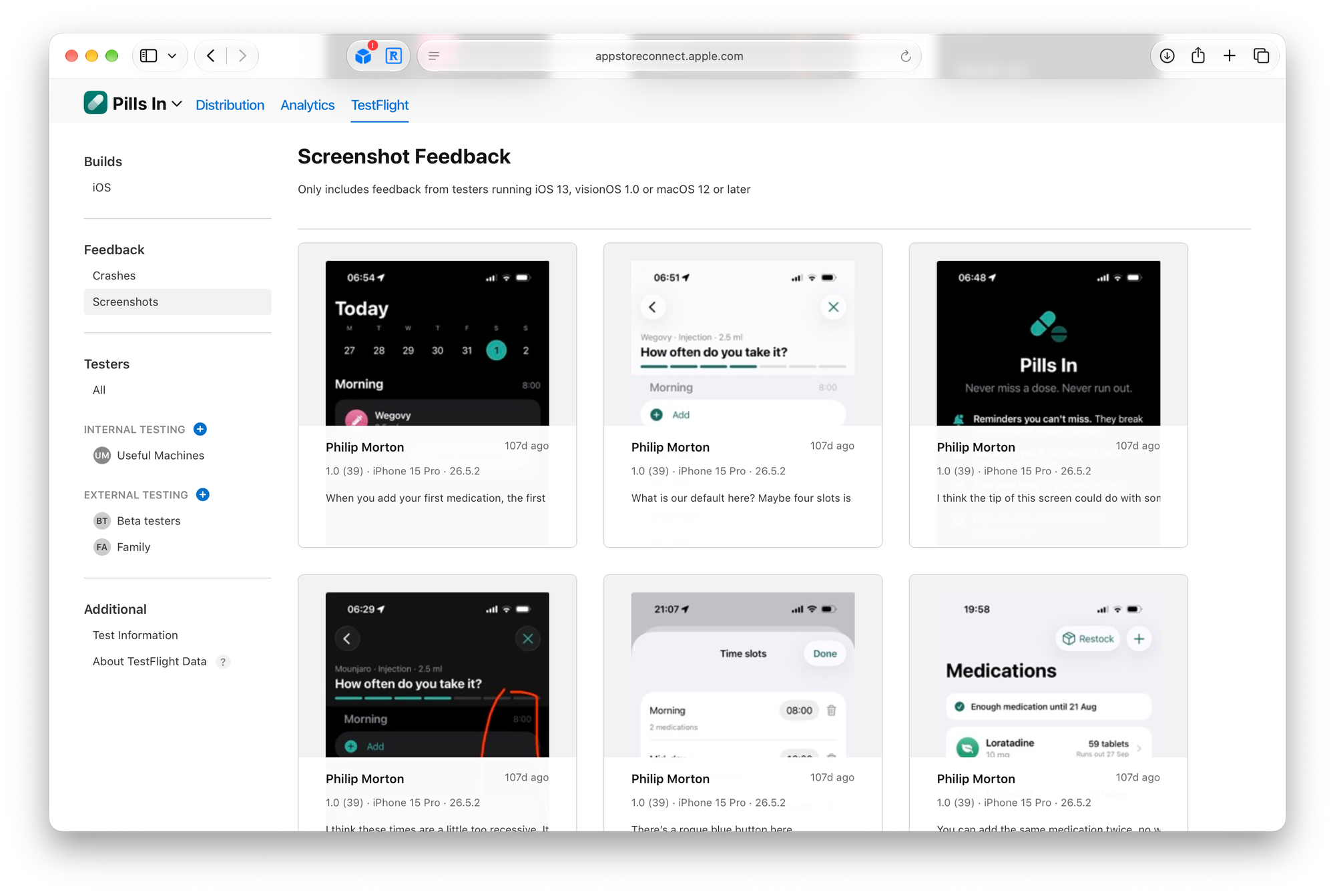
This gives you a tight feedback loop when you’re developing an iOS app: build → release to TestFlight → you (and others) test the app → submit feedback via screenshots → AI triages the feedback and creates GitHub issues → fix the issues → go back round the loop again.
Dad tested and dad approved
My dad used the beta version through TestFlight throughout development, and has now switched all of his medication tracking over to Pills In.
I’m sure it can be useful for other people too, so if you or someone you know takes several medications, give Pills In a try. Leave a rating or review if you like it, and if you’ve got feedback or ideas, get in touch.
I’d love to hear what you think.